With Power Apps Portals, we can setup Actions against an Entity List to perform Edit / Delete / View Details and many other operations.
To see more details on how to create the Actions against your Entity List please refer to this link: https://docs.microsoft.com/en-us/powerapps/maker/portals/configure/entity-lists#entity-list-configuration
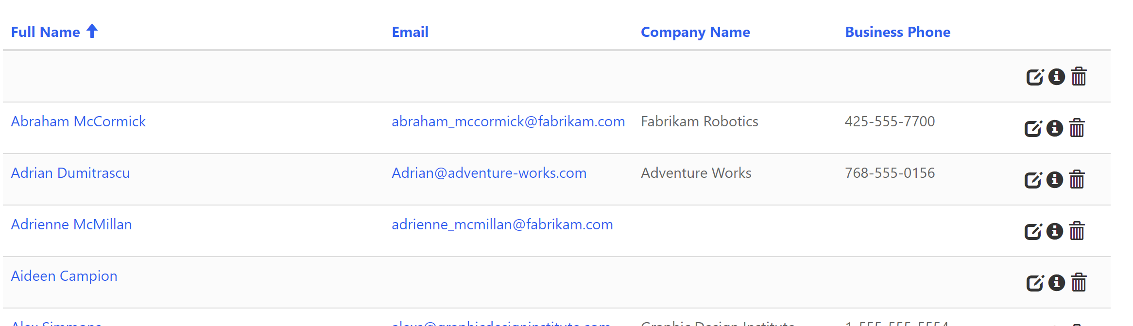
These Actions are displayed in a dropdown list on the right side of each record:
For a nicer UX, I will show you how to display the actions as icons within the list row.
There are a few different ways to achieve this, I will write two posts, one using CSS, and another one using JavaScript.
To start, I am creating an Entity List pointing to the Active Contacts view in my CDS environment.
Now I am creating the following actions against my Entity List and the necessary components involved:
- Edit Action – Entity Form to edit the record
- View Details Action – Web Page to view record details
- Delete Action – Deletes the record and refreshes list
- Workflow Action – Simple Workflow to send an notification e-mail to the Contact (this will only be visible if the Contact record has an e-mail, you can view more details on this in the following post: Power Apps Portals – Entity List: Conditional Action)
CSS
I am creating a CSS now that will perform the following actions:
- Hide the dropdown button
- Force the action menu to be displayed (without the dropdown button)
- Force the menu items to be displayed inline (the same row)
- Set the font-size as 0 so it will hide the text
- Set the font-size only for the <span> element (which contains the icon) to 18px (you can always change this size if you want it bigger/smaller icons)
- Set a different color for the hover event of the icon
.view-grid .dropdown.action>.btn {
    display: none;
}
.view-grid .dropdown.action .dropdown-menu {
    display: block;
    position: static !important;
    position: initial !important;
    border: 0;
    background: transparent;
    box-shadow: none;
    text-align: center;
    max-width: 95px;
    min-width: 95px;
    width: 95px;
    left: auto !important;
    top: auto !important;
}
.view-grid .dropdown.action .dropdown-menu li {
    display: inline-block;
    text-align: center;
}
.view-grid .dropdown.action .dropdown-menu li a {
    font-size: 0;
    padding: 2px;
    margin: 0;
}
.view-grid .dropdown.action .dropdown-menu li a>span {
    font-size: 18px;
}
.view-grid .dropdown.action .dropdown-menu li a:hover {
    color: #008C95;
    background: transparent;
}
For simplicity I am adding the CSS in the Web Page CSS section, but you could also apply this to the existing bootstrap web file, or create your own CSS web file.
Now by refreshing your page (remember always to clear the cache), you will have the following result:
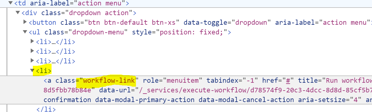
Ok, great we have the icons there, but where has my Workflow action gone?
By default, Workflow actions (and a few others) doesn’t have an icon related to the action, for this reason our CSS is not working properly. If I inspect the element, I can actually see the action is there, but as it doesn’t have any icon, we are hiding the text and there is nothing to be rendered:
How do we fix it?
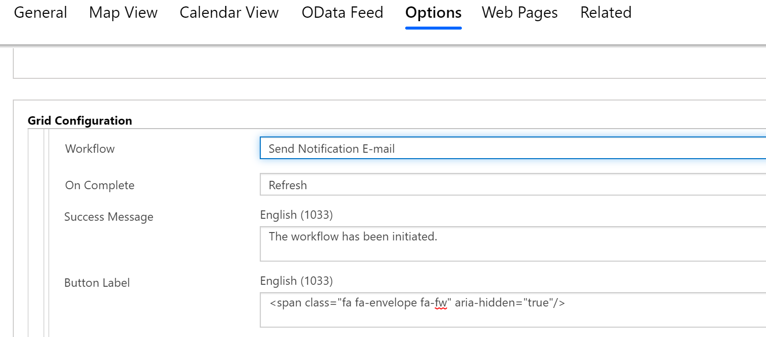
Simple enough, we need to add an icon to our action, we can do this in the Entity List options, by adding a <span> element to the button label property:
<span class="fa fa-envelope fa-fw" aria-hidden="true"/>
I am adding an envelope icon as my workflow represents sending an e-mail, but you can have a generic icon or anything else within the bootstrap/glyphicons: https://getbootstrap.com/docs/3.3/components/.
This is how my Entity List looks now:
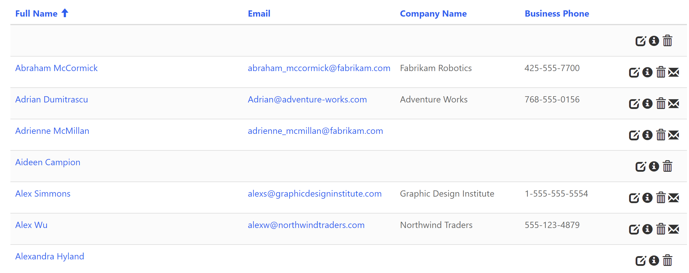
Conclusion
I think this really enhances the user experience within an Entity List/Subgrid in the Portal, and the CSS method is a very simple implementation.
If your list contains too many actions, you might end up with a very busy web page and a poor UX. For this I will write a separate post using JavaScript, keeping the main actions as icons, and having secondary actions in the dropdown.
A special thanks to my colleague Jonathan Pavan that helped on this.
 Oliver Rodrigues
3 thoughts on “Power Apps Portals – Adding Icons to Entity List Action buttons via CSS”